Mobile app for meaningful connections
UX Case Study
Client
Institute of Art, Design and Technology
Timeline
Oct – Nov 2024
My Role
UX Design
Project Tools


Quick introduction
Our team of UX Design students: Klaudia, John, and I teamed up to address an issue aligned with the UN Sustainable Development Goals. Through research and team discussions, we recognized the importance of community well-being and intergenerational isolation, leading us to focus on the UN goal 10: “Reduced Inequalities”.
Main Goals
1. Design an app that would bridge the gap between youth and elderly.
2. Create a sense of community
3. Enable users to leave a legacy
Inspiration for the app name?
Cara, comes from Gaelic and it means “friend.”
OUR APPROACH
Design Thinking Framework
Empathise
01
To better understand our users and their needs
Define
02
Clarify the problem
Ideate
03
The more ideas, the better!
Prototype
04
Creating the solution
Empathise
Research review
Our research began by exploring the concerning issue of loneliness, which affects a large portion of the population, particularly those aged 50 and above. Ward, Layte, and Kenny (2019) report that over 37% of people aged 50+ experience loneliness, which rises to 45% among those aged 74+. Through a qualitative literature review, we learned about UX best practices for ‘digital natives’ and ‘digital immigrants’. For more details, please view our initial research on the Miro board.

Heuristic Evaluation
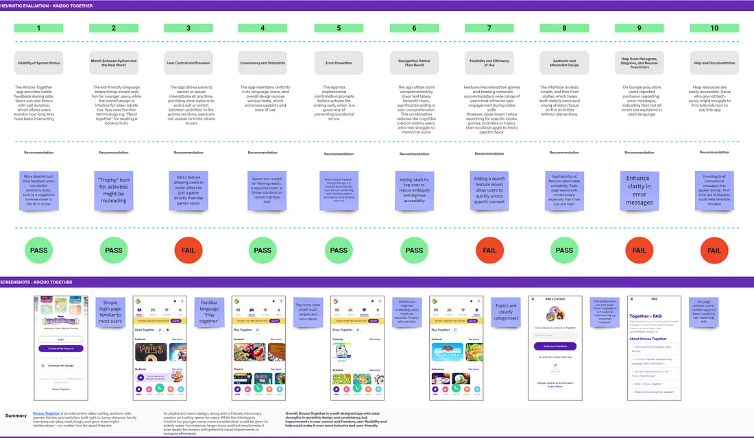
Initially, we were inspired by the Adopt a Grandparent initiative that connects volunteers with elderly in care homes, but it is lacking a digital implementation.
To evaluate competitors, I conducted a heuristic evaluation of Kinzoo Together , a video-calling app designed to connect friends and families across distances. While Kinzoo excelled in areas like visibility of system status and match between system and the real world, we identified opportunities for improvement in flexibility and efficiency of use as well as clarity of error messages.
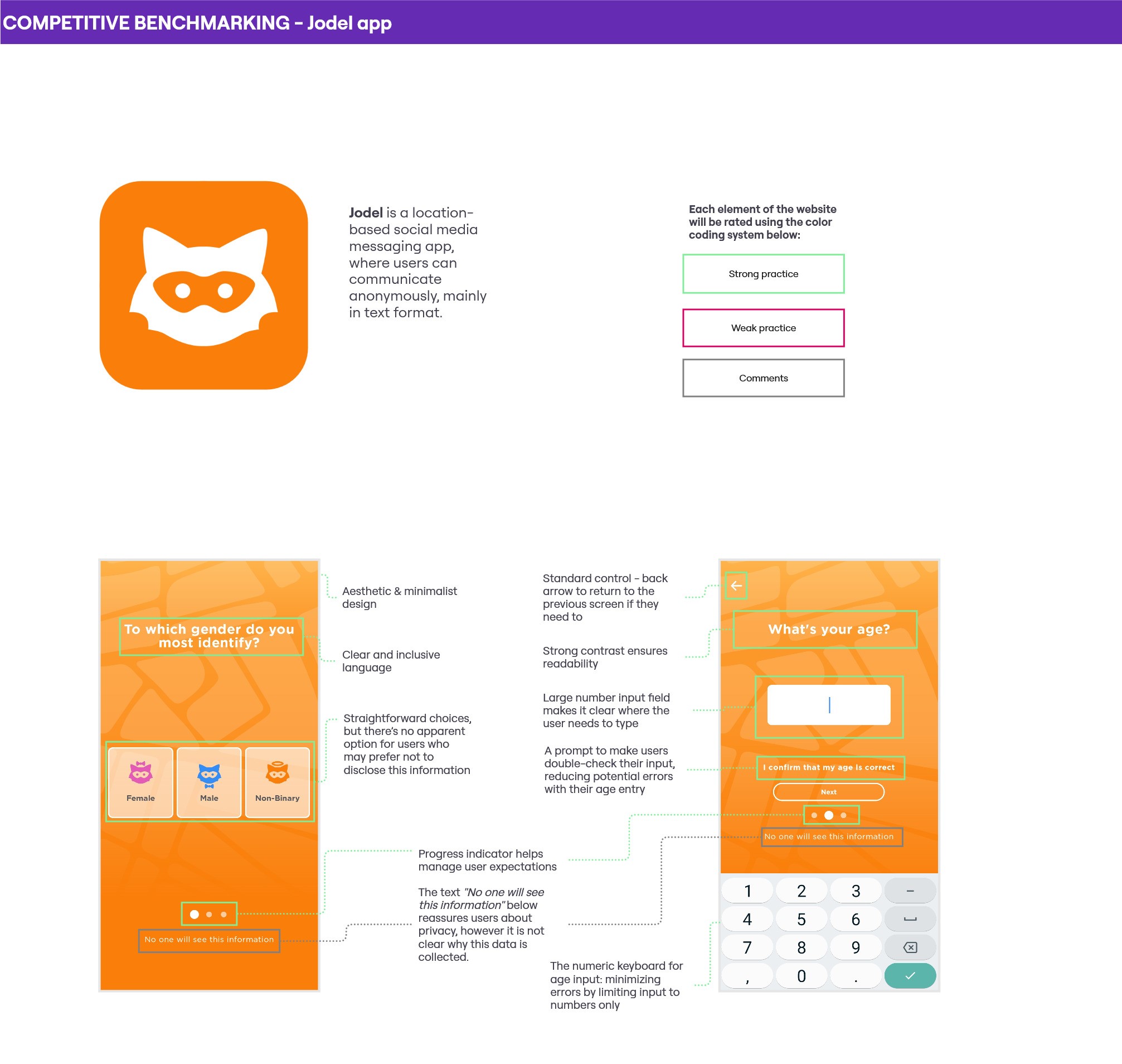
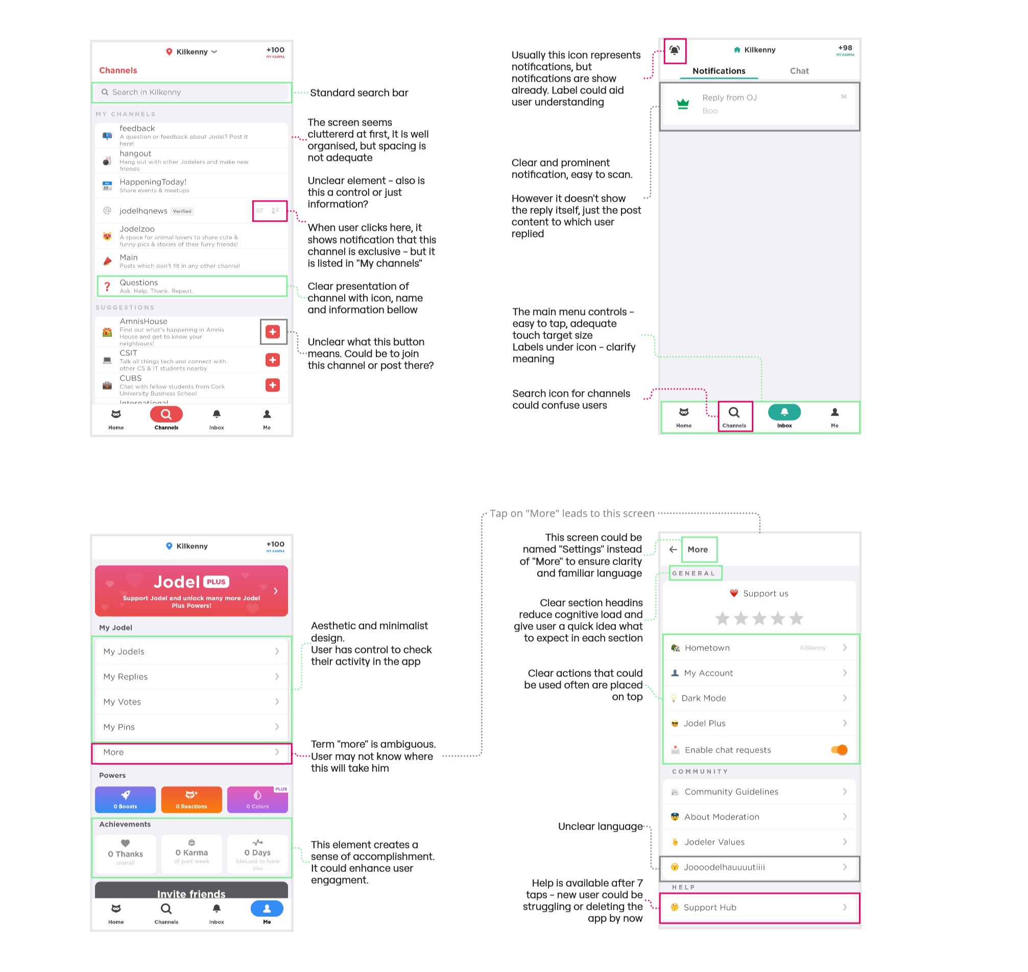
Competitive Benchmarking
We decided to shift our focus toward encouraging in-person interactions rather than solely relying on digital connections. This decision was informed by research reviews, which highlighted that while digital connections can provide support, they do not fully address the root causes of loneliness and social isolation.
I evaluated an app focusing on location-based connections. Jodel app features a minimalist design and friendly interface, however the app could benefit from improving help and documentation.
Also, we noticed that a gap in the market since we couldn’t find similar apps designed for elderly people.

Define
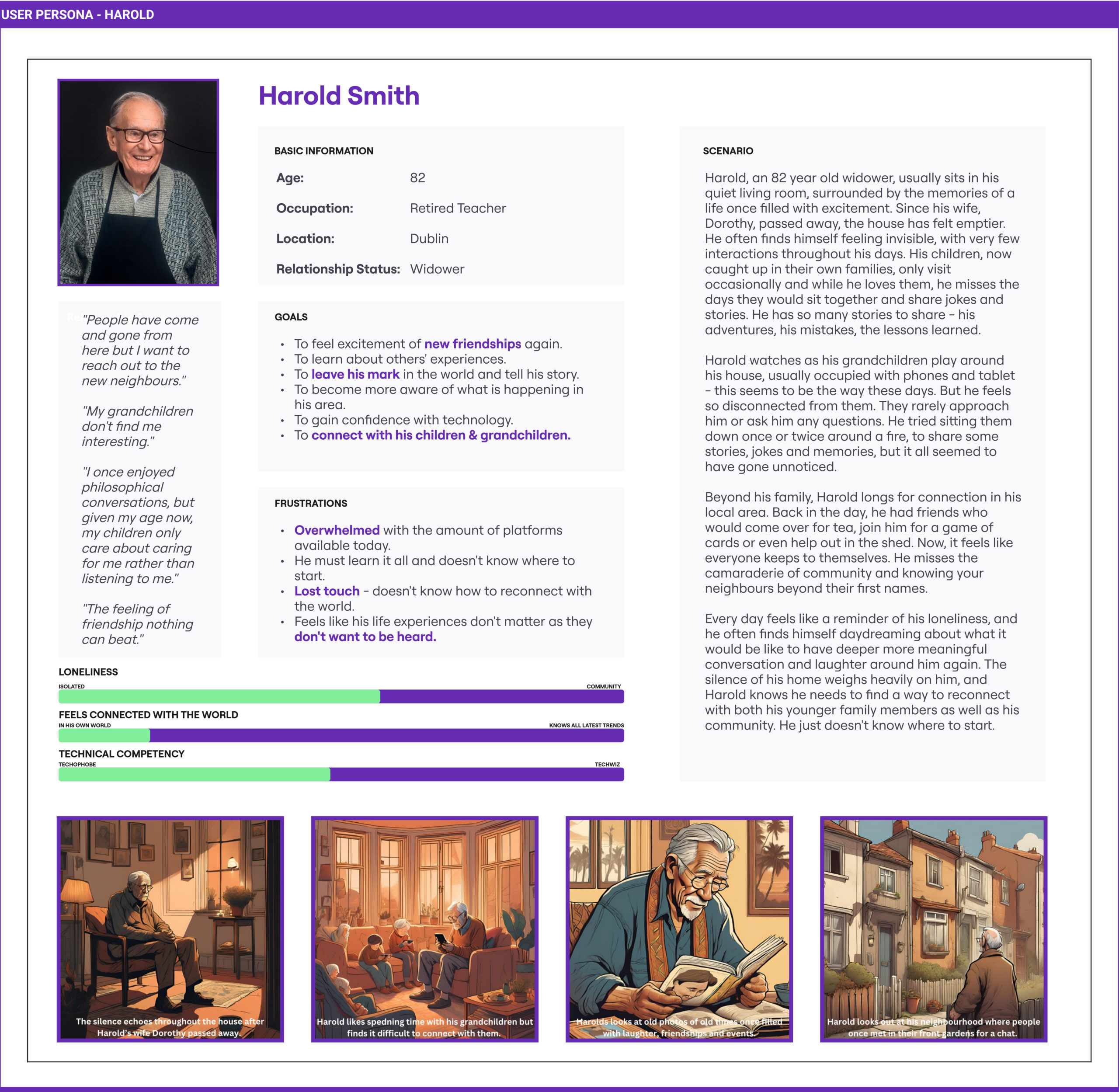
User Personas
Creating the persona helped us to understand our users – what their abilities and strengths are, and how they experience loneliness.
Primary Persona: Harold – an elderly man aged 82 who often feels lonely.
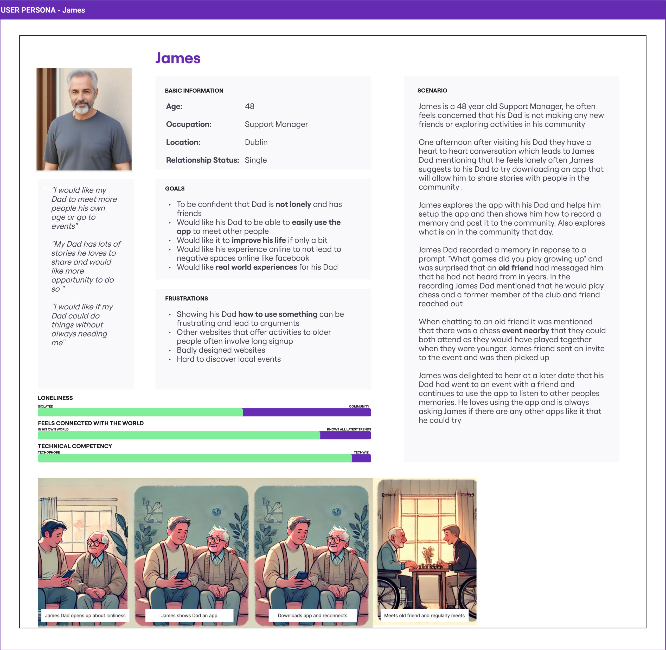
Secondary Personas: Daniel (youth user) & James (middle-aged user).
Key insights to user needs:
- Elderly people seeking to leave a legacy (Harold)
- Younger people wanting more meaningful community connections (Daniel)
- Middle aged people facilitating connections (James)
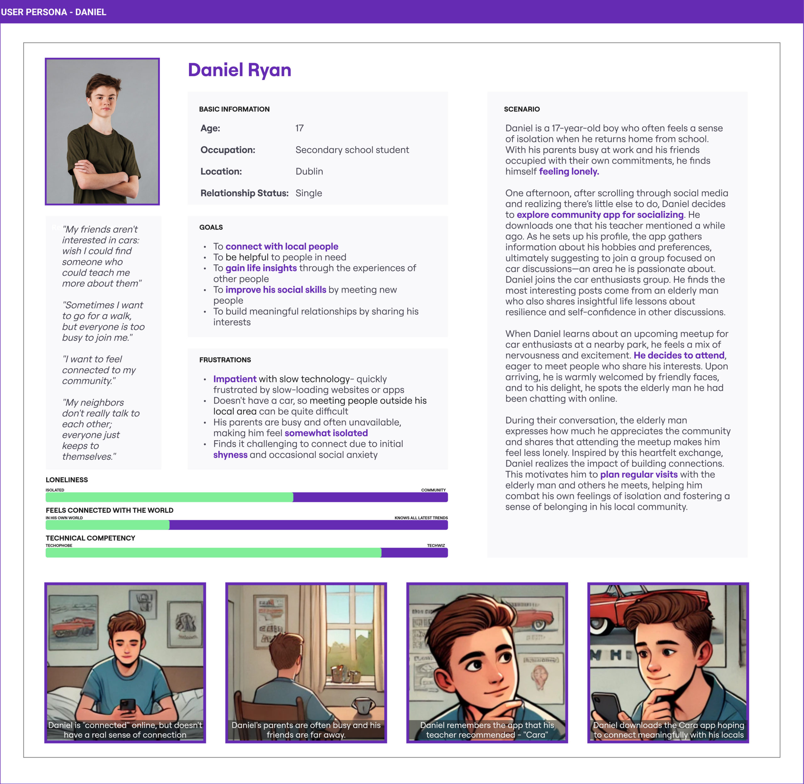

Would a teenager be interested in this app?
What are we trying to solve?
Building from our research our team had a brainstorming session focused on how an app might address the problems faced by the personas we had created.
Core Themes that emerged:
- Real world interaction: Cara app is just a digital facilitator in creating long lasting relationships.
- Connecting elderly and youth: Intergenerational communication
- Leaving a legacy: Being able to share stories with others on a platform
- Community engagement platform: Promoting interactions based on location
- Safe online socialising: An app that is a safe space for everyone
From the five core themes, we created Point of View (POV) problem statements, which we then reframed into How Might We (HMW) questions.


Ideate
How Might We Statement
“How might we create safe digital experiences that facilitate meaningful intergenerational connections, reducing feelings of isolation within local communities?”
Brainstorming
Following on from our redefined problem statement we tried to better define what features the app should have to address the updated statement. Our brainstorming session generated over 50 potential features ranging from local event management to voice recorded life stories.
We decided on five main features:
- Create a post,
- recordings about life stories,
- daily prompt,
- local events and
- profile with age, interests and hobbies.

Prototype
Paper Protoype

What connects our ideas?
In a collaborative review, we identified three main similarities:
- Tell Your Story – prompt on the homepage
- Connect with others – prompt Diary
- Real-world interactions – local community events
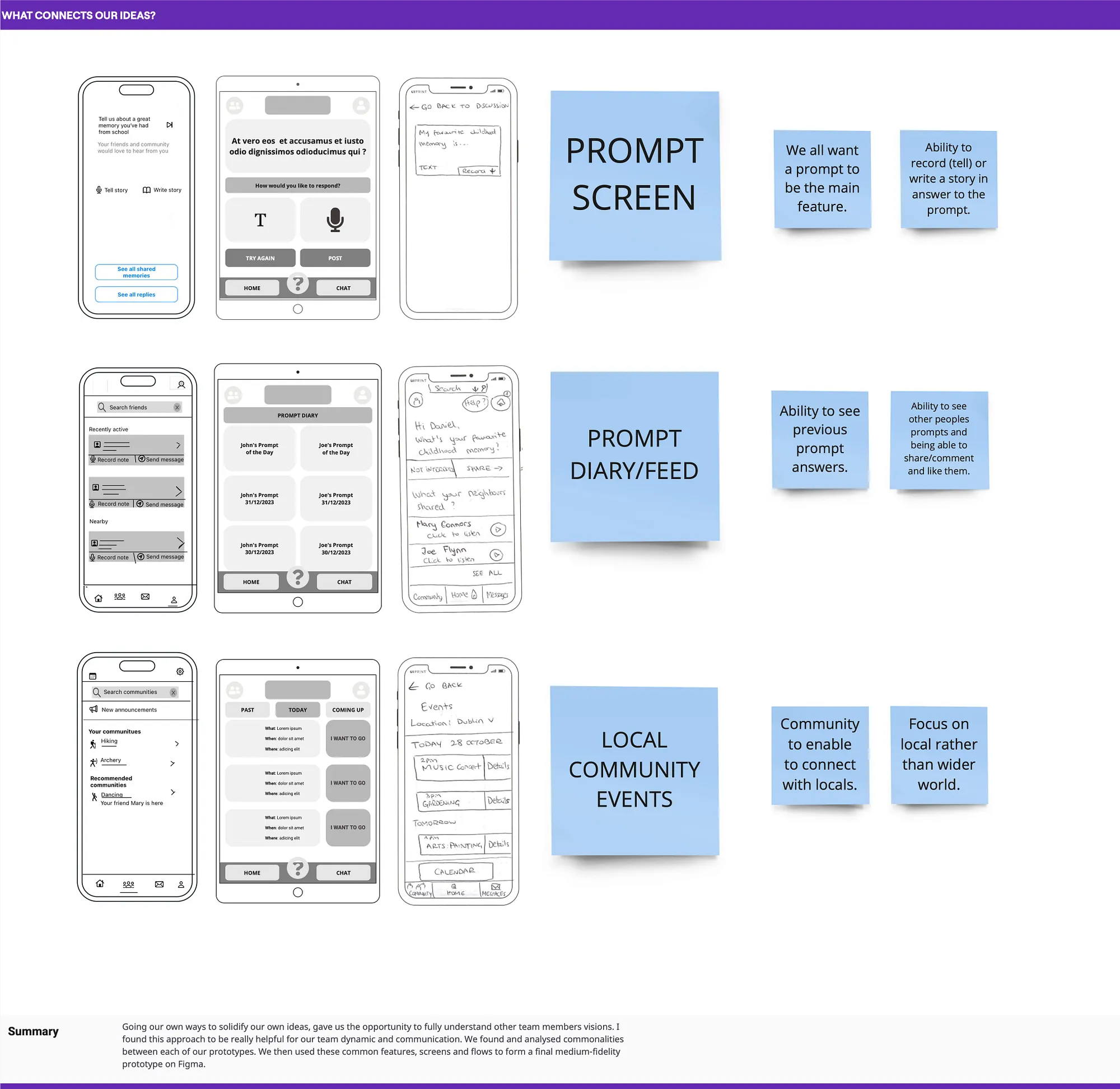
Medium – Fidelity Protoype
We developed the core features in mid-fidelity prototype. Due to project scope, we did not proceed with further prototyping.
Validation
Visibility of System Status
When the user posts their daily prompt, there is no feedback showing that it has been successfully posted.
Recognition Rather than Recall
Unlabeled icons on the top bar may confuse users.