Hotel Halara
UX Case Study
Client
UX Design Institute
Timeline
July – Dec. 2023
UI Mentor
Mustafa Al Awad
My Role
UX Design
Project Tools


MY PROCESS
Recipe for UX Success
Research
01
Concept
02
The key stage: defining further solutions
Design
03
A prototype is worth thousand words
Validation
04
Testing the prototype: the moment of truth
Research
Understanding users’ goals is key to creating products that truly resonate with their needs. Secondly, we must discover if users can achieve these goals and, if not, find the reasons why.
Competitive Benchmarking
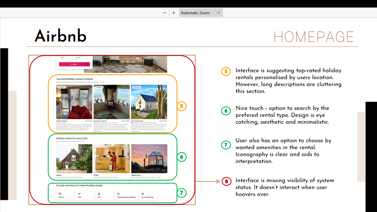
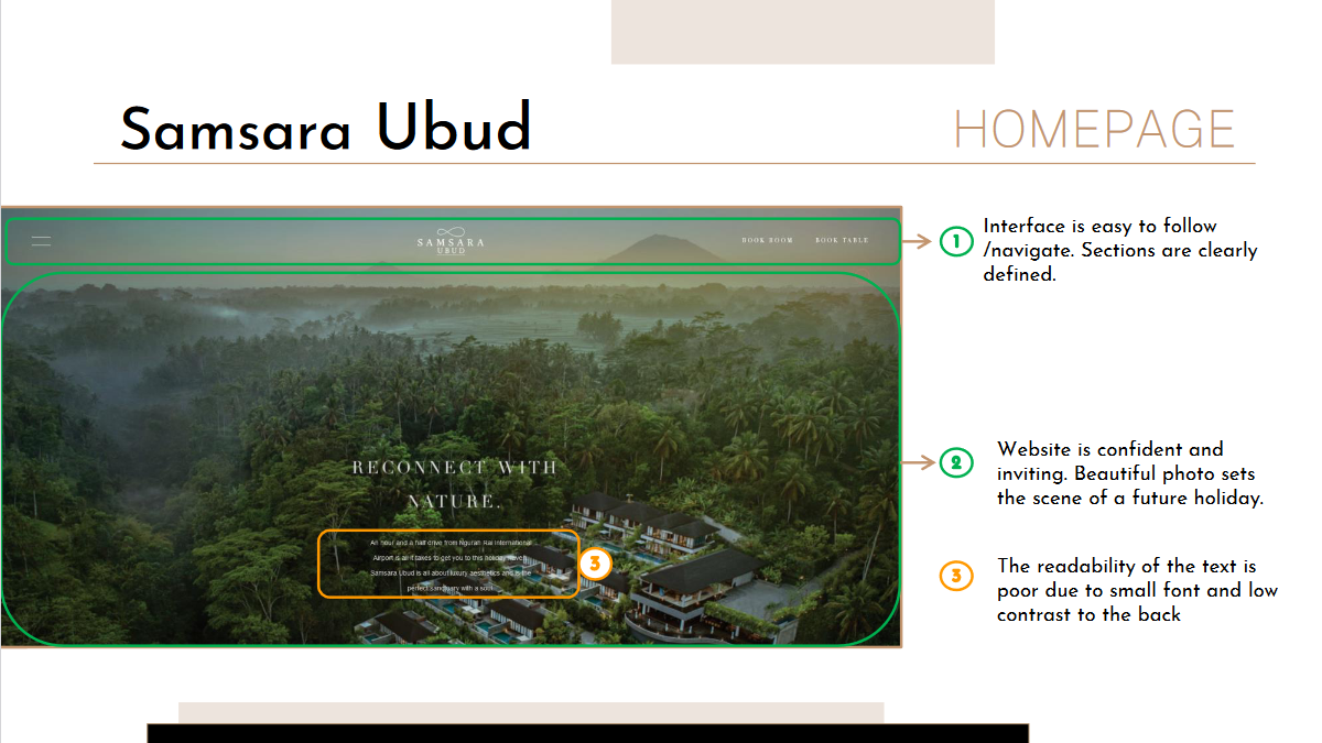
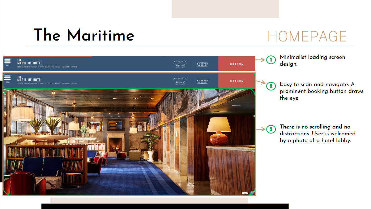
For this project, I analyzed four competitors: Loveholidays, Airbnb, Samsara Ubud, and The Maritime. Loveholidays and Airbnb operate as booking platforms, while Samsara Ubud and The Maritime are hotel websites. Notably, Samsara Ubud received the highest total visits in February 2023, with 4.0 million visits, compared to Airbnb’s 1.1 million.


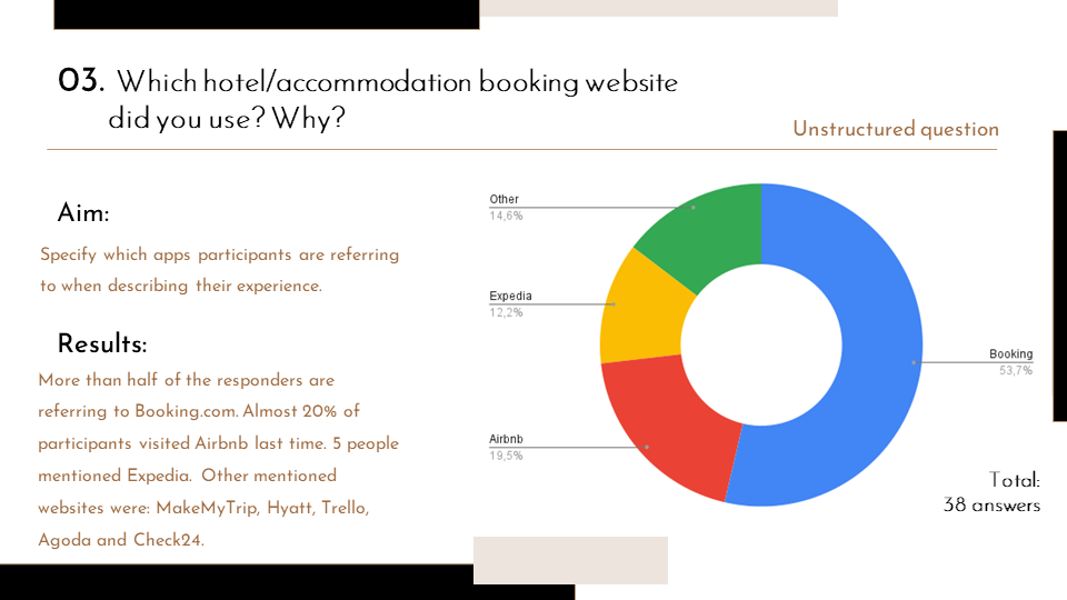
Online Survey
Key Findings
Recent Engagement with platforms
A significant 77.7% of participants had used hotel websites in the last three months.
User satisfaction with hotel booking websites is just 2.6/5.
Preffered website among participants

Key Findings
Filters
Users expect to have filters to adjust their search, especially filters by location, price and meal plan.
Room description
Room photos
Users prioritize seeing photos of the exact rooms they are booking, and inadequate room photos can consequently lead to a lack of trust.
Room Extras
Users prefer flexibility and choice of room extras.
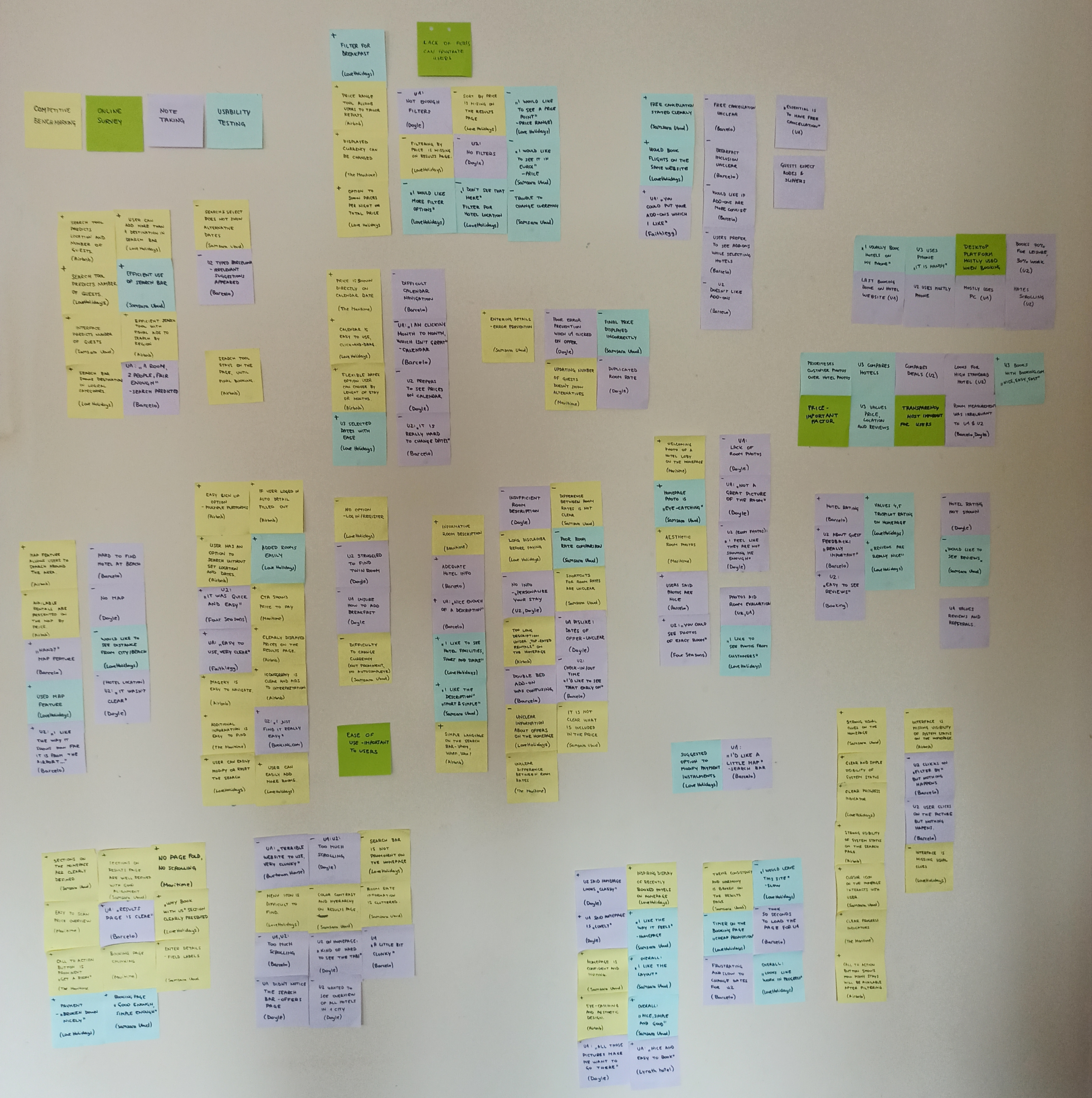
Analysis
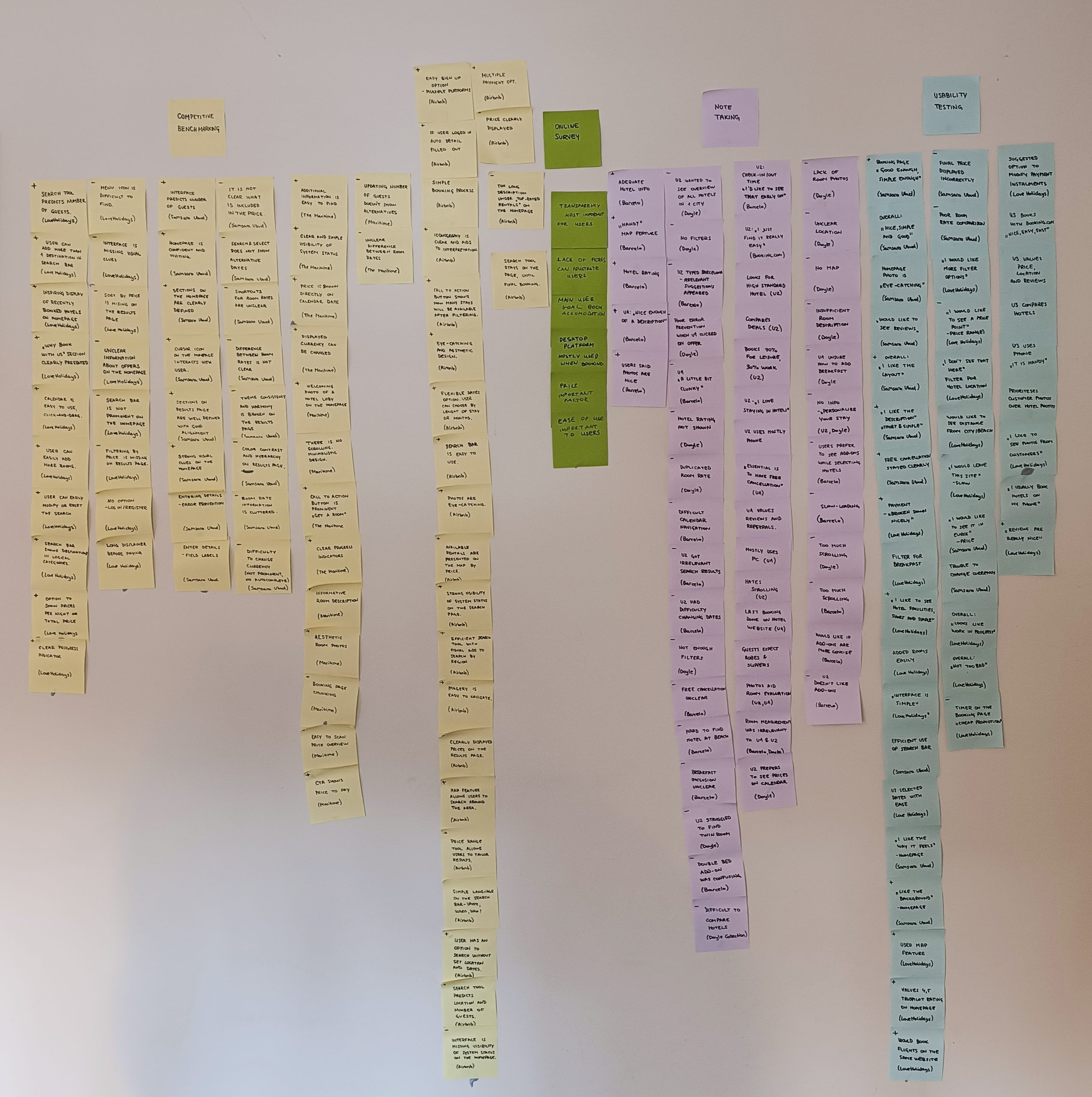
Affinity Diagram
After researching the problem, I utilized the K-J method, also known as an affinity diagram. Initially, I collected raw data and shared it with my friend. Together, we digested the data and used post-it notes to record observations. I then grouped notes into categories based on common themes, such as: search tools, map/hotel location, search results/filters, and ease of use/clarity.
Customer Journey Map
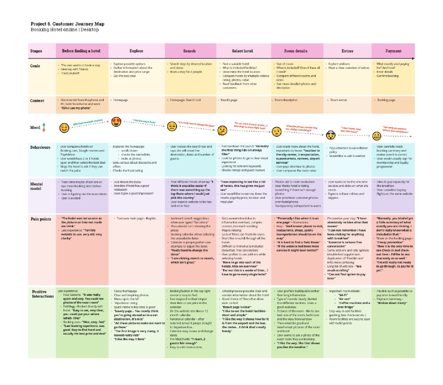
Emotional Roller Coaster


How Might We (HMW) Statements
How might we help users quickly find rooms that meet their specific needs without feeling overwhelmed?
How might we make room descriptions easy to scan?
How might we make adding extras feel flexible and unintrusive?
How might we ensure users feel confident and in control when reviewing their booking summary?
Concept
Flow Diagram

During the analysis, I identified opportunities to optimize the hotel booking flow. For example, I implemented filters to allow users to narrow their search according to their needs and option to skip add-ons.
This user flow diagram outlines all screens users will encounter and the actions users can take at each step, from the home screen to payment confirmation.
How Might We (HMW) Statements Solutions
How might we allow users to narrow down their search?
We can implement robust filtering options. This includes providing filters for price range, amenities, and other relevant criteria. Additionally, incorporating advanced search capabilities, such as sorting options, can help users quickly find what they’re looking for.
How might we design room descriptions for easy scanability?
Room descriptions should be organized in a way that allows users to quickly scan and understand key information. This can be achieved by using bullet points or lists to highlight amenities and by providing clear headings for different sections of the description. Additionally, the use of icons can further enhance scannability by visually representing different amenities or features.
How might we give users freedom and control when adding extras to their stay?
To give users freedom and control when adding extras to their stay, we can allow users to easily add or remove extras from their booking without having to navigate through multiple screens. Additionally, users will have the option to skip this step altogether if they prefer not to add any extras to their booking.
How might we present the booking summary concisely and clearly?
The booking summary should be dynamically presented to the user as they select their room. Chunking of information will be employed to ease comprehension, allowing users to quickly grasp key details such as booking dates, room type, and total cost. Additionally, the price breakdown will be prominently displayed and updated in real-time as the user selects additional options, ensuring transparency and clarity throughout the booking process.
Design


Prototype
After completing a UI course, I undertook a complete iteration of my prototype, enhancing its usability and visual appeal.
My objective was to create a more intuitive and visually appealing product that better aligns with user needs and expectations.
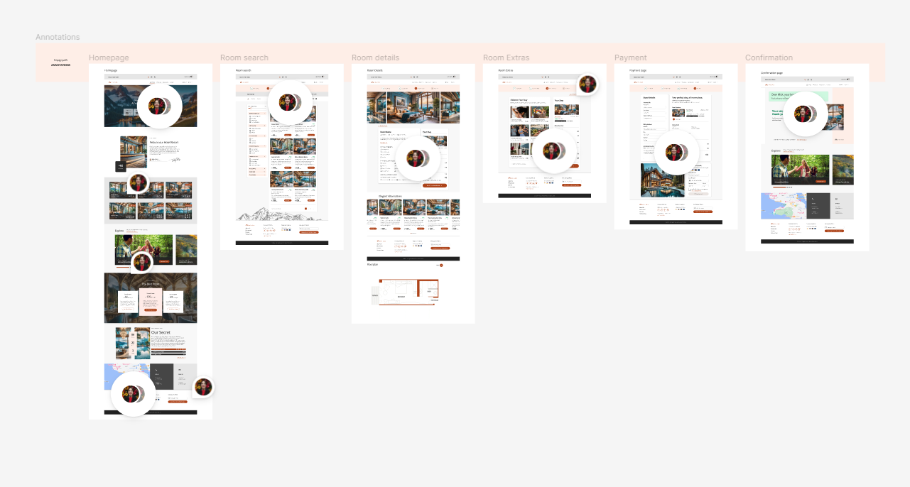
Annotations
I created clear annotations to help the development team understand the design vision better. By providing detailed annotations, ambiguity or confusion is eliminated, reducing the need for constant communication between designers and developers.
Validation

Floor plan
Participants found the floor plan feature useful. They think the visual information about the room layout can be helpful.
King bed option
The king bed option was appreciated by the users, indicating that it meets the user’s specific needs or preference.
Filtering Options
The filters were chunked into categories, making it easy for users to locate and select their desired criteria.
Hotel location
It would be beneficial to include location in the room description for clarity. Hotel location on the homepage was not enough.
Calendar position
Users of smaller laptops may have had trouble with the location of the calendar, as it was not fully visible.