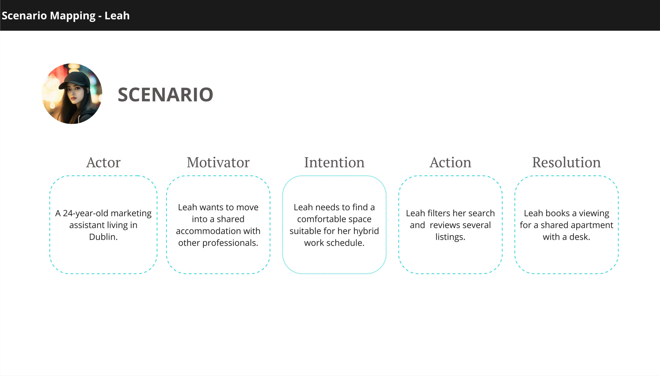
Room searching experience
UX Case Study
Client
IADT – Daft.ie
Timeline
Dec ’24 – Jan 2025
Worked Along
Olgu Saglik
My Role
UX Design
Project Tools


Project Overview
This case study investigates Daft’s user experience, Ireland’s leading real estate platform, focusing on the mobile app’s shared accommodation search process.
Primary Research Question
Important Note
This project was developed as part of our coursework for the Institute of Art, Design and Technology.
OUR APPROACH
Design Thinking
Empathise
01
experiences
Define
02
Design opportunities emerged
Ideate
03
The more ideas, the better!
Prototype
04
Developing solutions to user problems
Testing
05
Validating our design solutions
Empathise
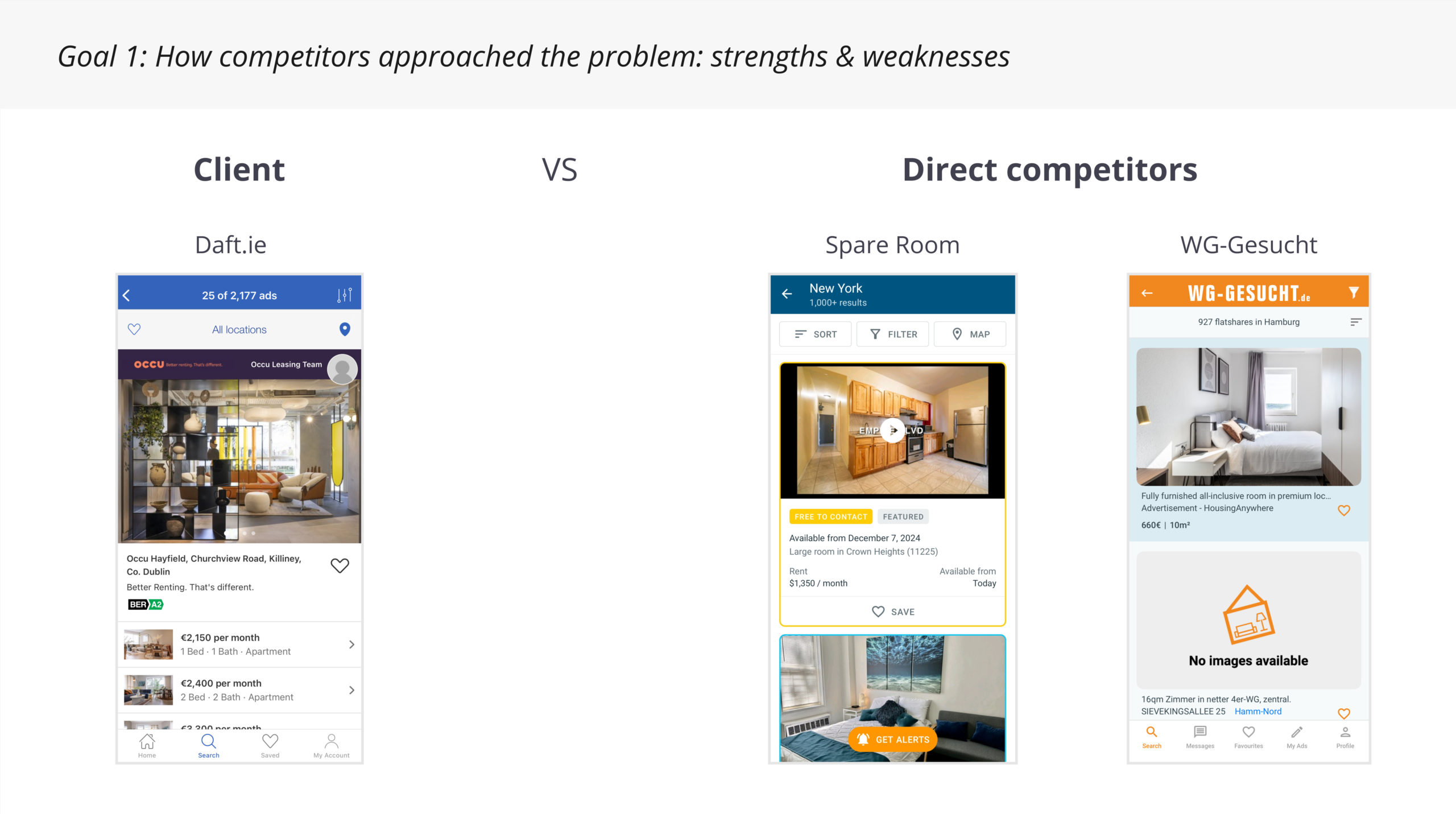
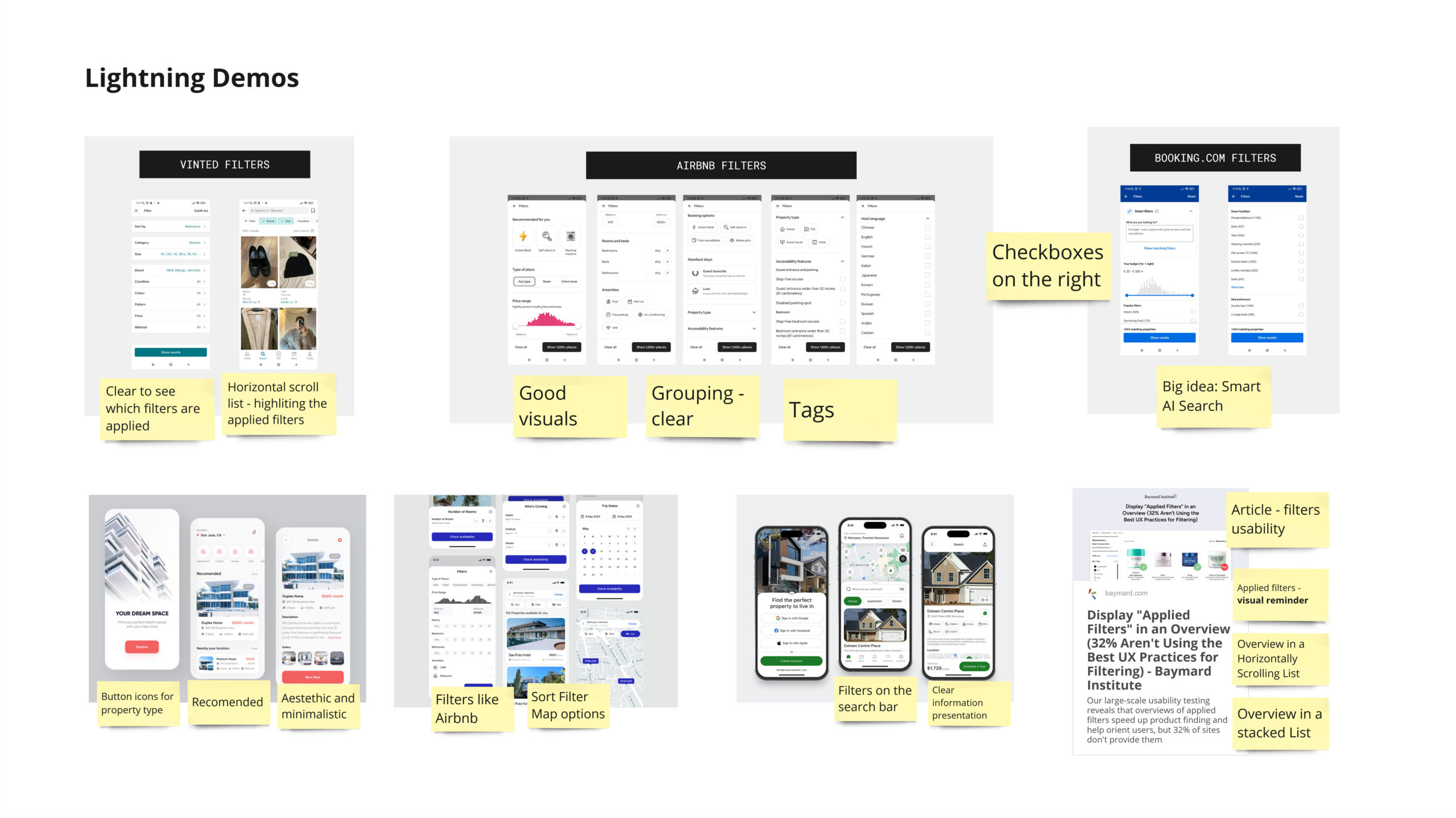
Competitive Benchmarking
Our first step was to compare Daft.ie with other competitors regarding its functionality, usability, and effectiveness. We analysed two direct competitors from different countries for a broader perspective: SpareRoom US and WG-Gesucht.
Key Findings
Search Flow
Competitors use a search flow with which users are familiar: users begin their search by entering the location. In contrast, Daft.ie has a less intuitive flow since it forces users to set their filters first.
Filtering Options
The competitors provide users flexibility and efficiency over their search through filters, allowing them to narrow their search based on various conditions. SpareRoomUS filter design particularly stands out with in-depth filters, such as criteria for housemates’ age, gender,
employment, smoking and even diet styles.
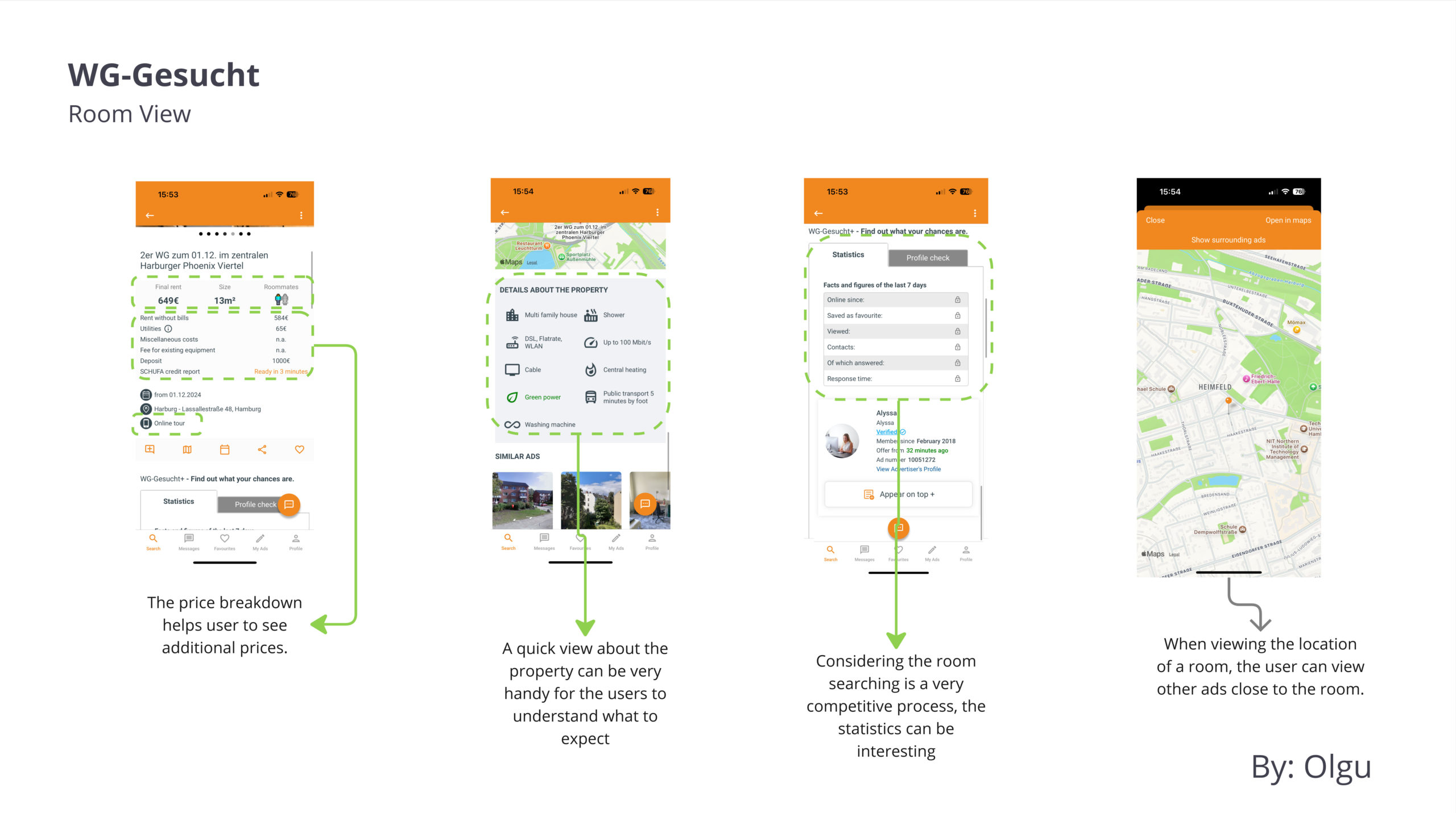
Detailed Room View
Moreover, competitor apps present room listings with greater detail. They organised
information into categories and incorporated icons for easier comprehension and recognition.


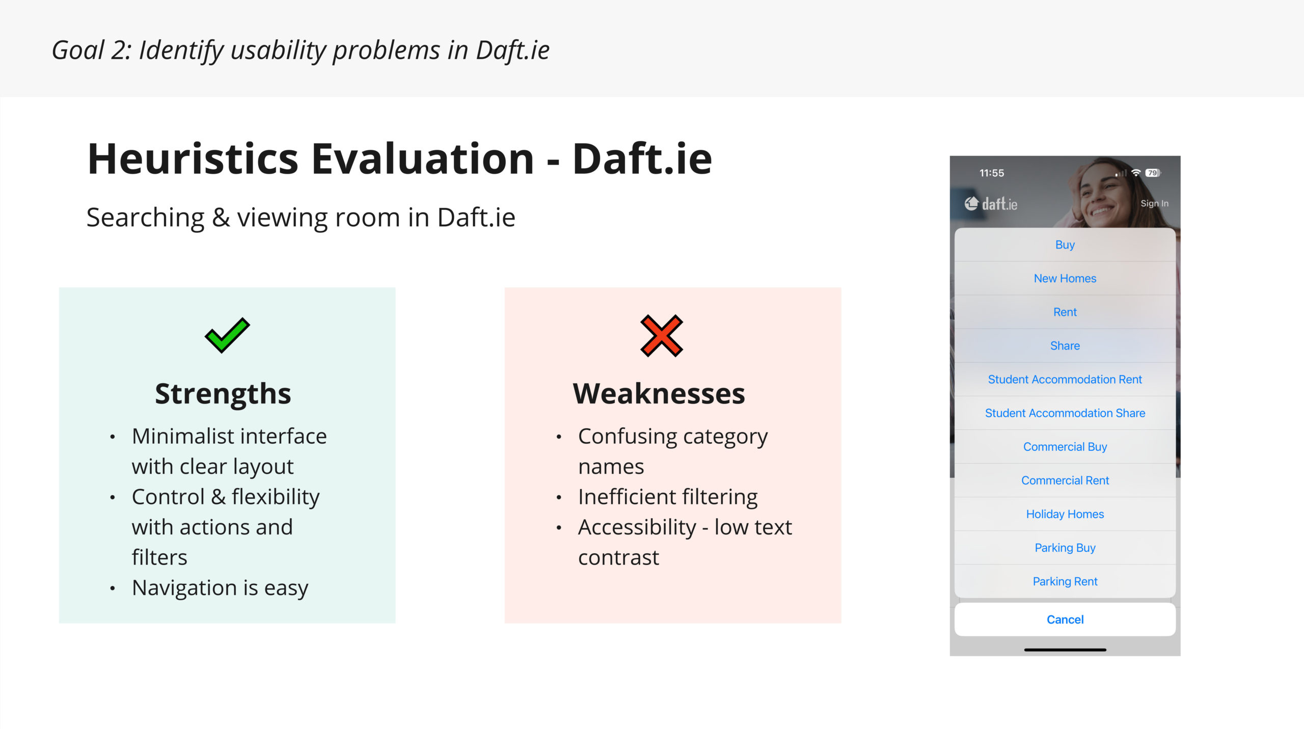
Heuristic Evaluation
All three platforms had a similar final result, showing weaknesses in four and strengths in six of Nielsen’s heuristic principles.
Key Findings
Match between system and the real world
the real world’ due to confusing terminology.
Accessibility Issues
Recognition rather than recall
User Interviews
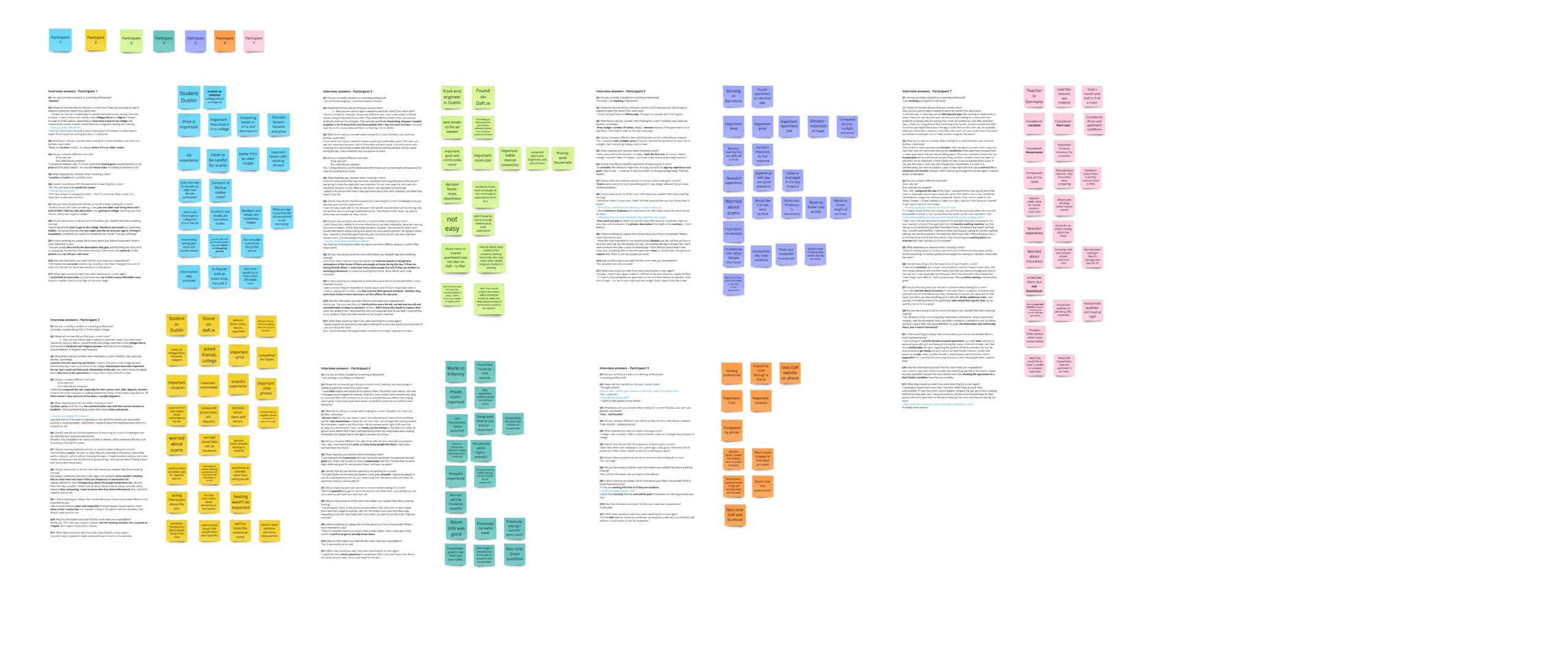
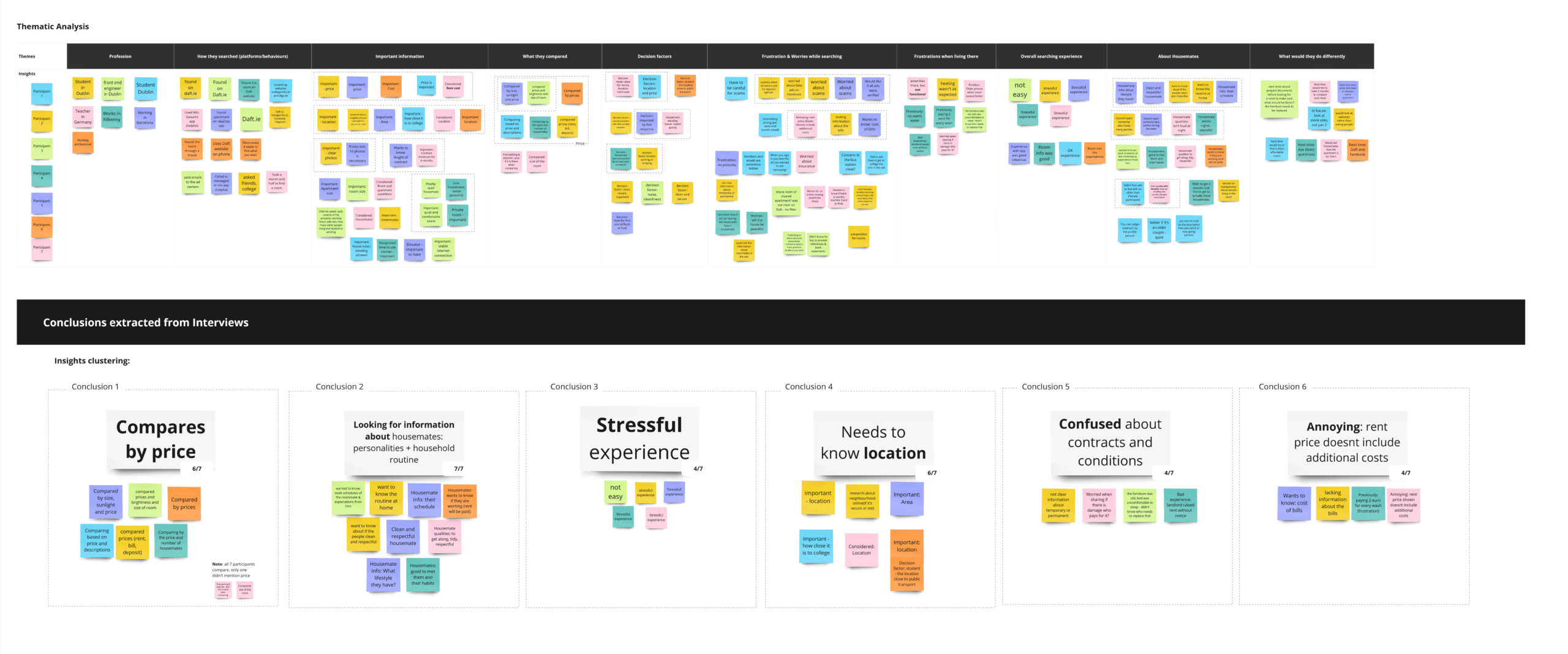
Key Findings
Looking for information about housemates
Current User Experience
Pain Points
confused about contracts and conditions in their previous experiences, and the same portion expressed frustration when the price does not include additional costs such as bills.
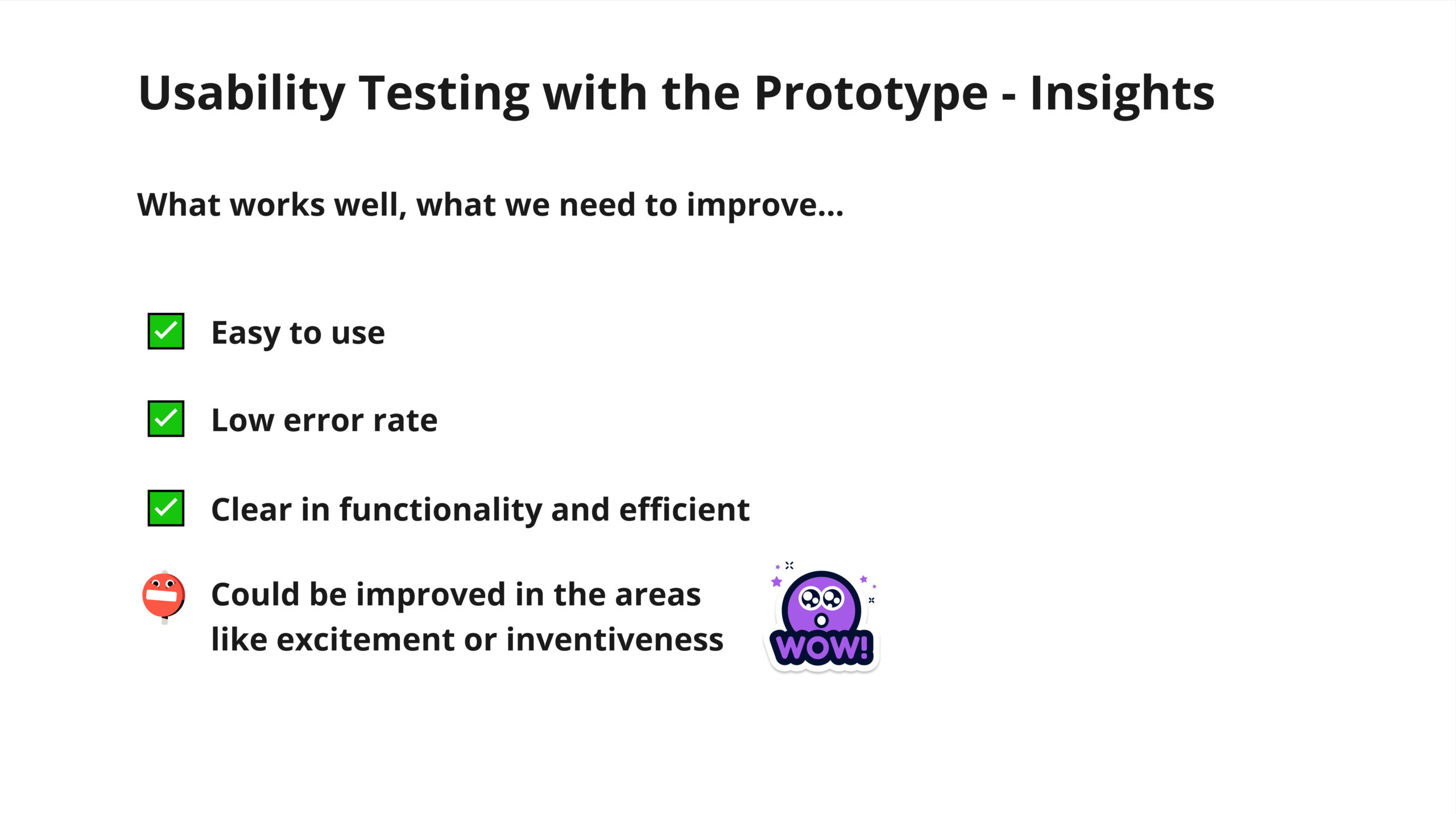
Usability Testing
Main pain points
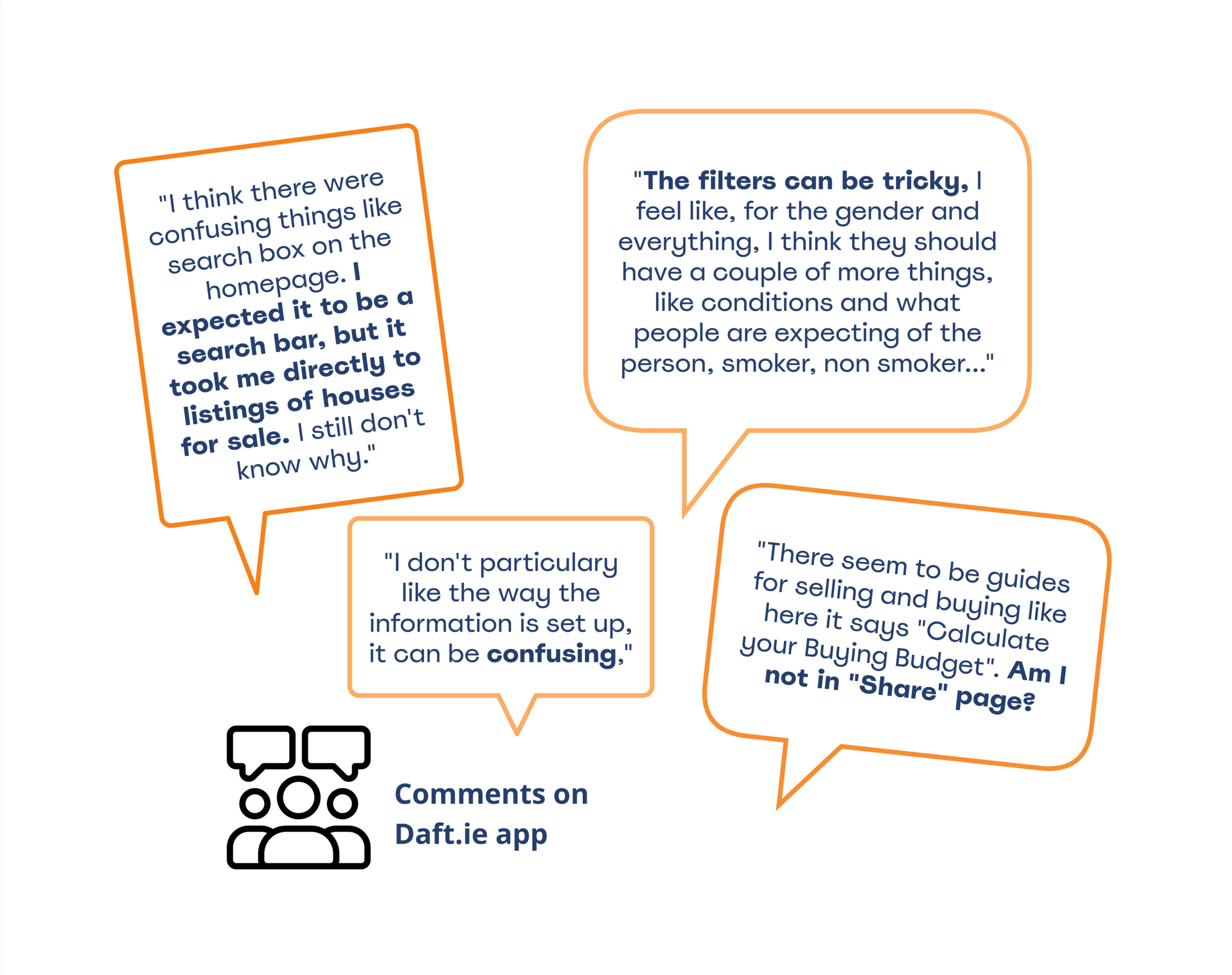
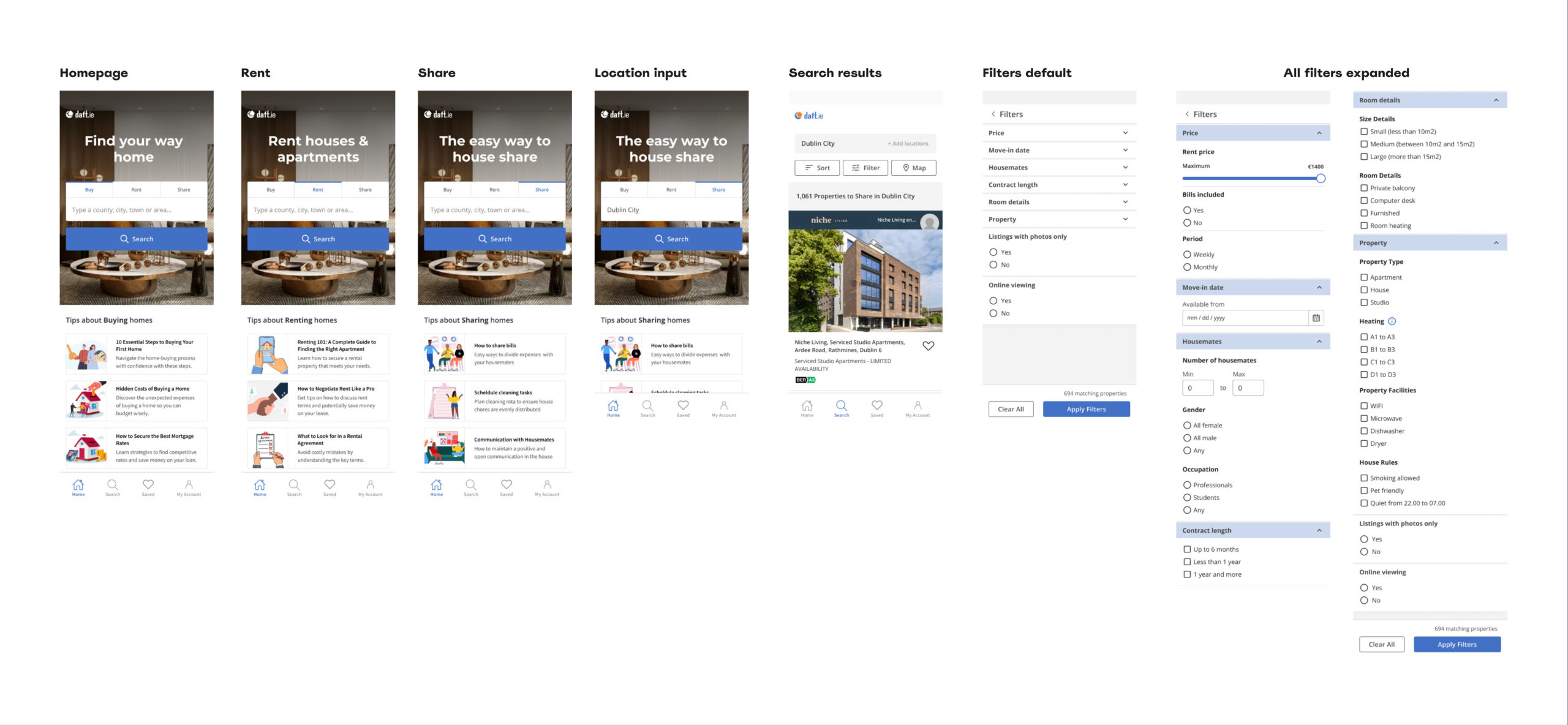
Confusing Search
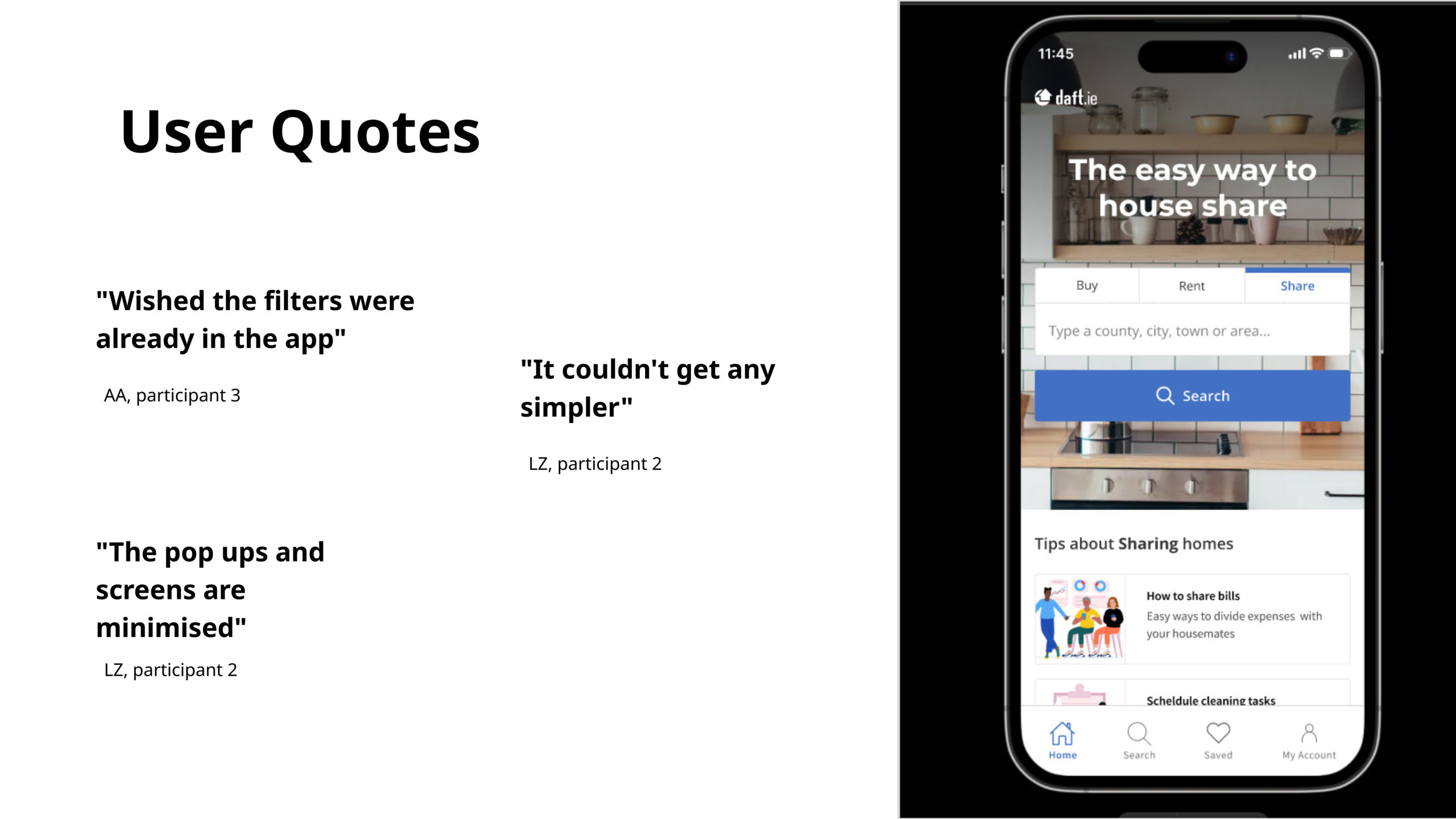
The first touchpoint confused users. Users did not expect to set the filters page before their desired property location. Additionally, the location input could be more discoverable following the visual hierarchy to stand out to users.
Inefffective Filters
Another highlighted weakness regarding filters was search categories. Categories have similar terminology, such as Share and Student Accommodation Share, which caused confusion. After choosing Student Accommodation Share, the “Location” input changed to College”, further confusing users.
Missing/confusing Property Information
Users generally prefer detailed listings, as this helps them save time when making comparisons. Contrarily, unclear and poorly described listings were less appealing and led users to skip those listings. Additionally, users expressed frustration regarding pricing, particularly bills and pricing schedules
Define
People First
While all identified issues are important, we prioritized to solve issues regarding the search flow and filtering options.
Because these experiences:
- could lead to early abandonment
- affect the overall user experience
- are intial touchpoints
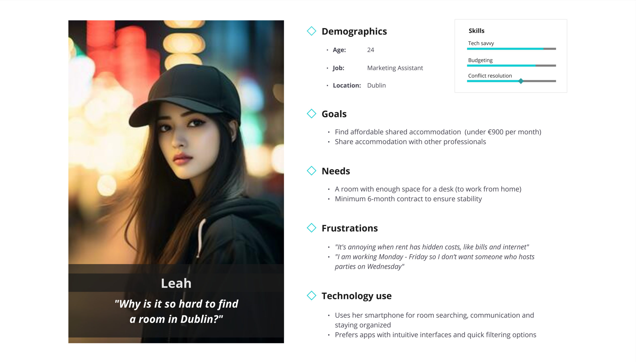
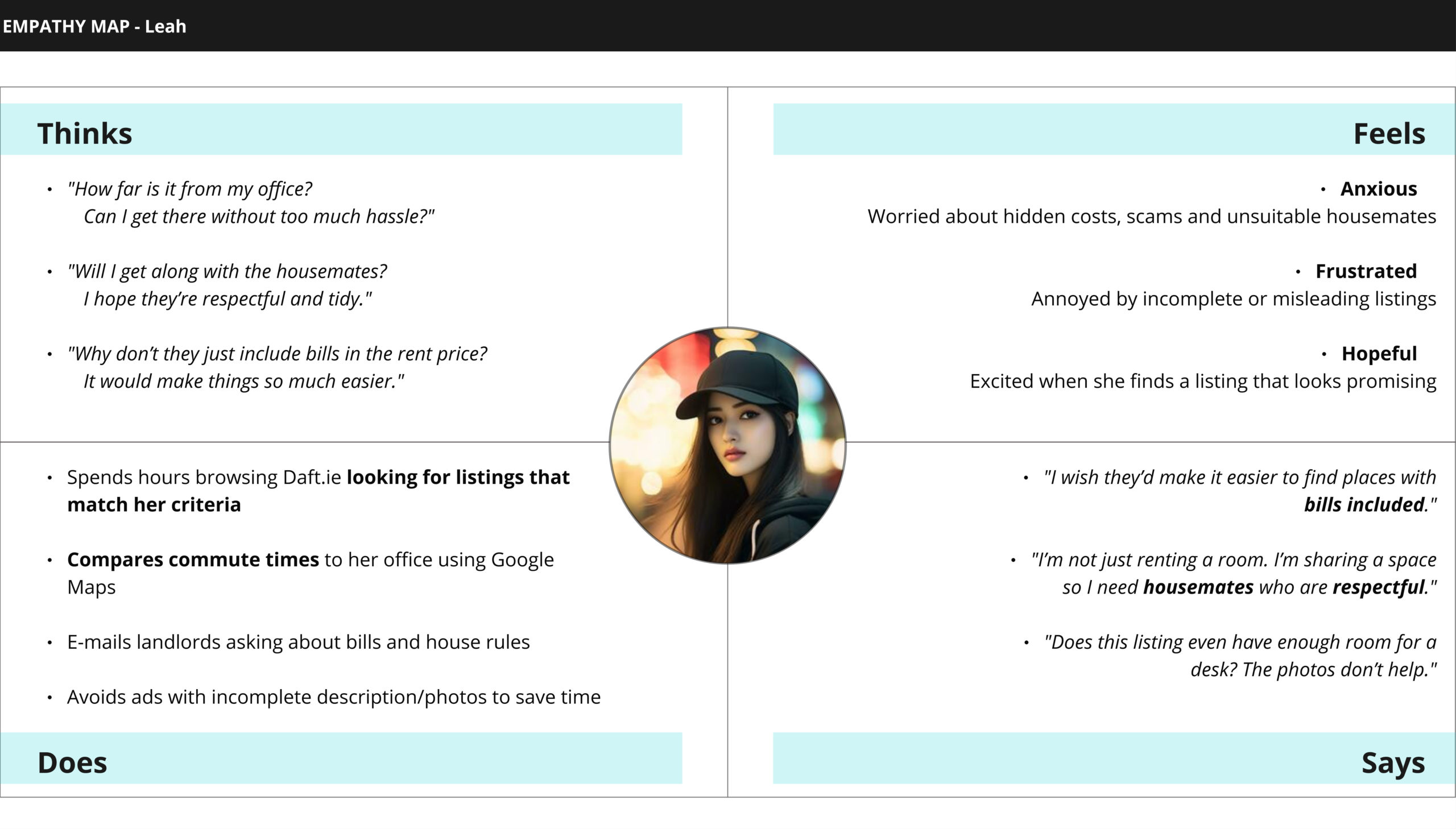
Students/young professionals have problems with confusing search and inefficient filters when searching for a room on Daft mobile app
Ideate
The more ideas, the better!
Once we defined where to focus our efforts, we got inspiration by what’s out in the world. We searched the internet for relevant examples of how others have approached the same issue (search and filter flows).
Crazy 8’s
We completed Crazy 8’s to boost brainstorming and creativity. This exercise helped us clearly communicate our ideas which we later presented and dot voted for the ones we think would work best.
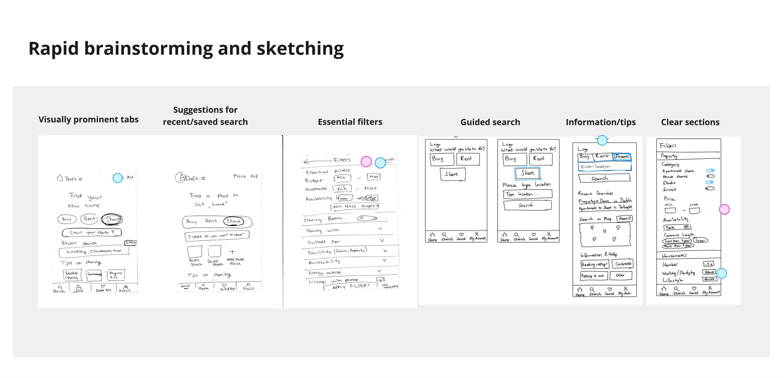
Paper Prototype
For our final sketch, we converged ideas from voted sketches into one final sketch.
We agreed on the following:
- Chunking for clarity
- Remove external links
- Prominent search bar
- Familiar terms
- Added filtering options
- Relevant content (e.g. user clicks on share – tips for sharing)
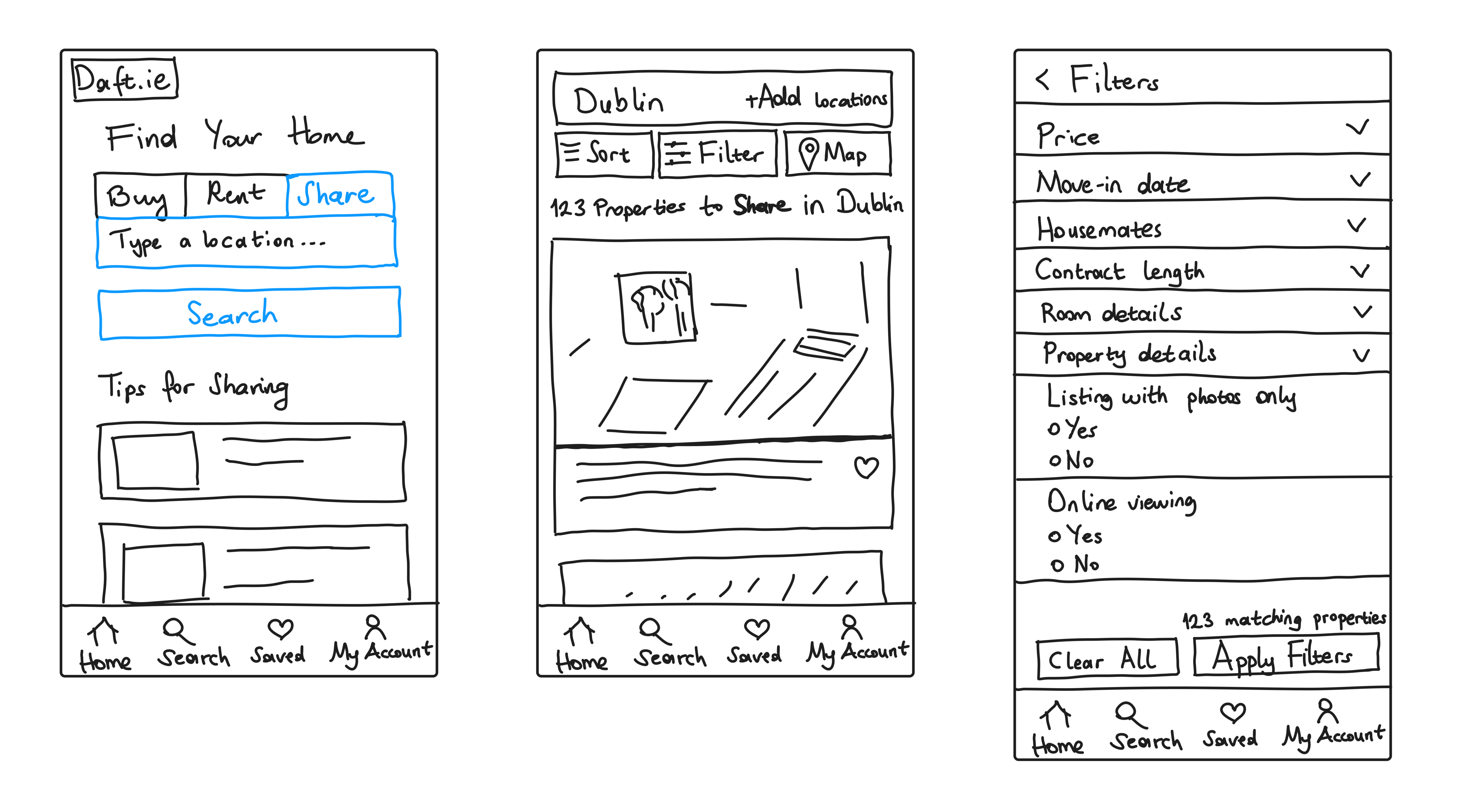
Prototype
First Prototype
We initially placed filters within an expandable accordion, but this design required multiple clicks and did not display all available options, which could negatively affect the user experience. We added a minimum price option to the price slider to improve usability and moved the toggle to the right for better accessibility on mobile devices.
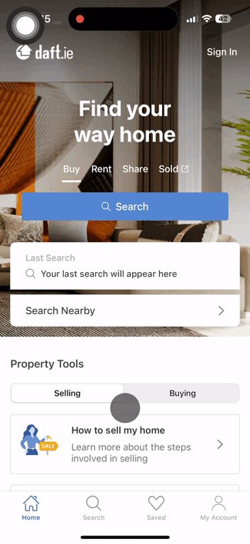
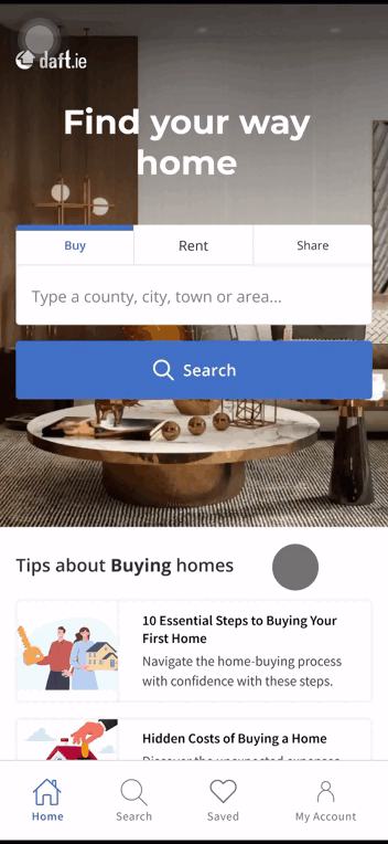
Comparison of Existing App and Our Prototype
Daft.ie
First Iteration
Testing
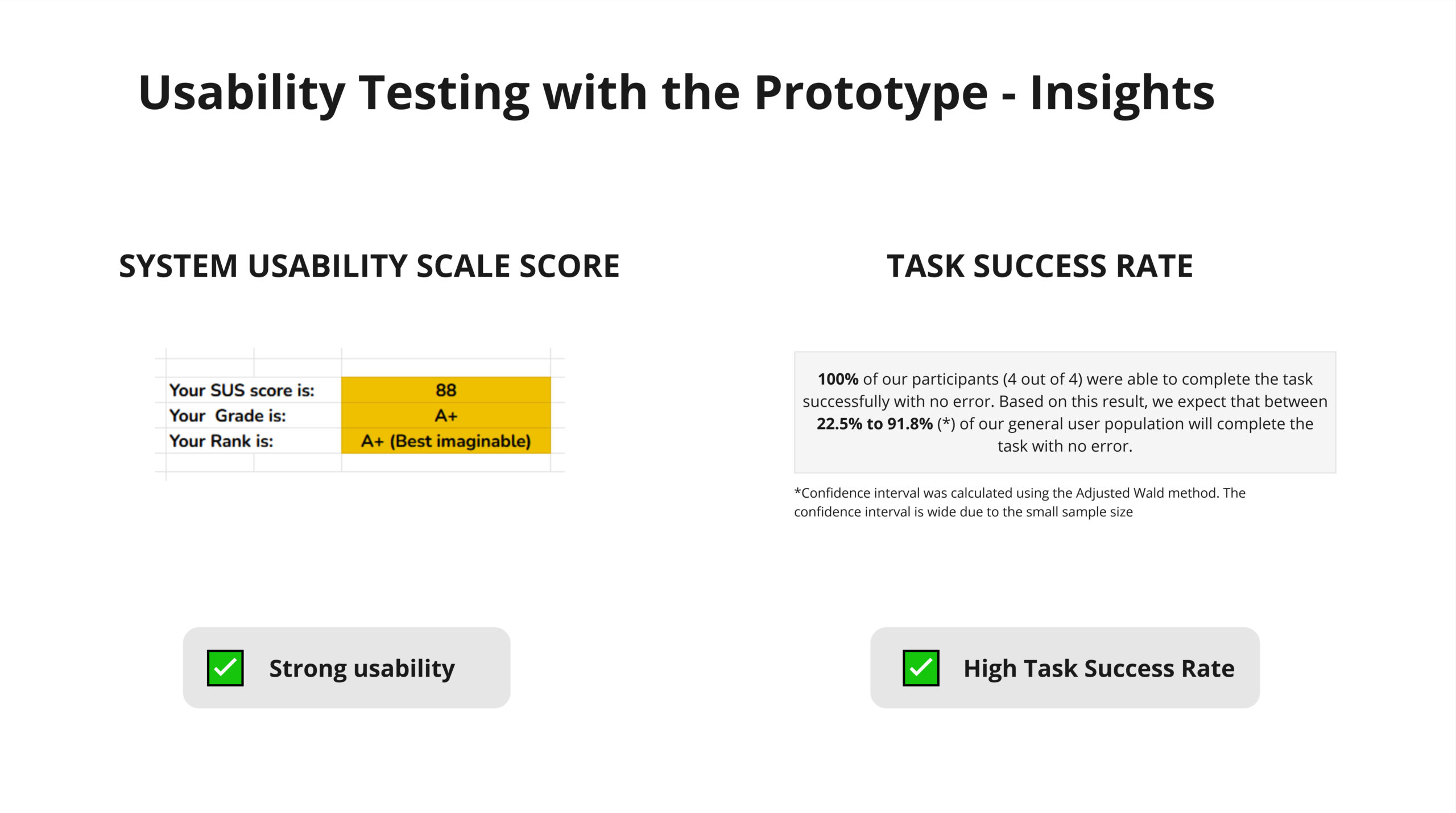
Usability Testing Objectives
1. Assess Task Success
Can our users successfully complete given tasks during usability testing?
2. Evaluate Usability
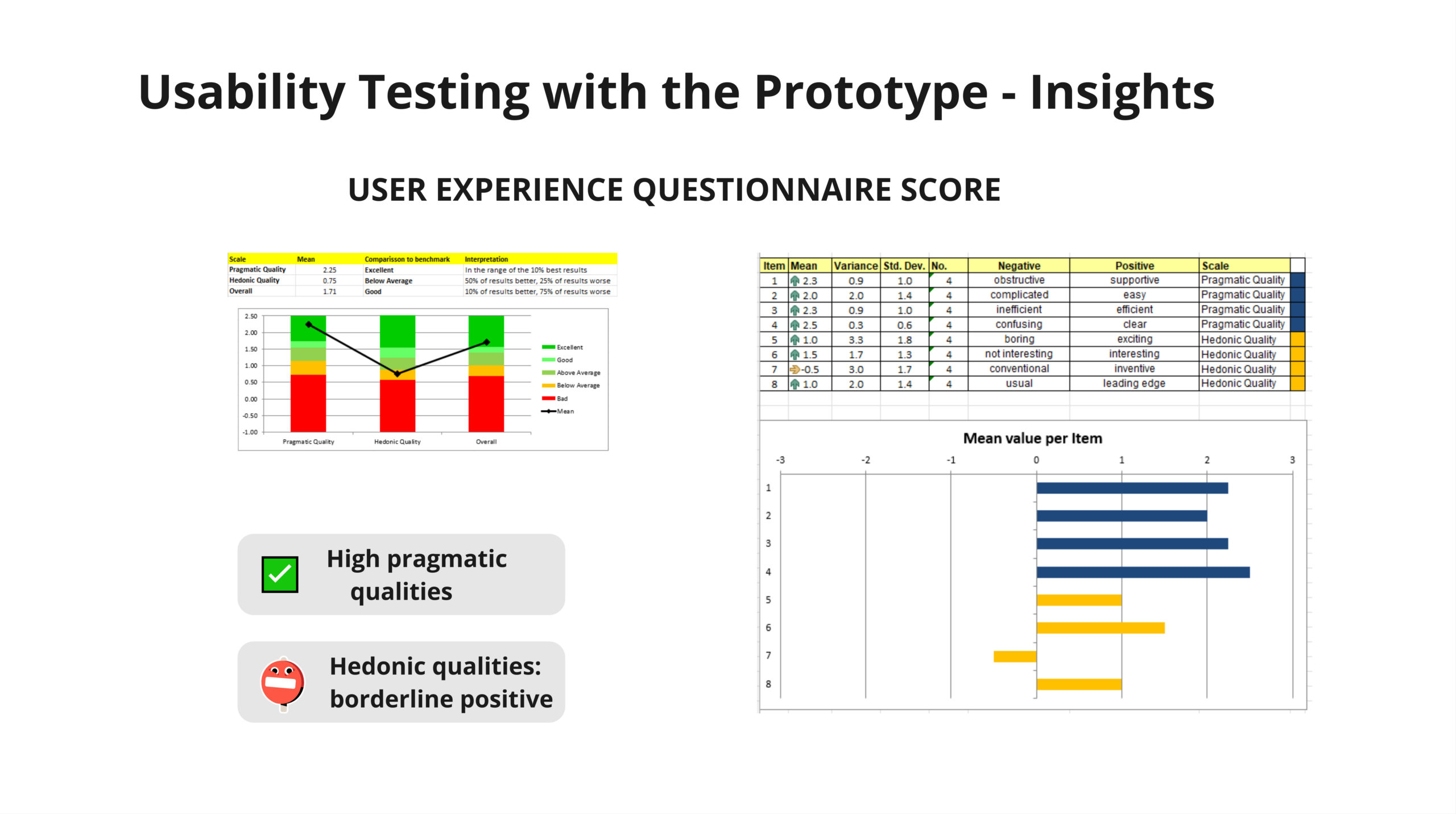
Use the System Usability Scale (SUS) to measure users perceived ease of use of the search and filters
3. Understand User Experience
Use UEQ-S to gain insights into both the pragmatic and hedonic aspects of the redesigned app.
4. Identify Design Opportunities
Observe user behaviour to identify areas where the search and filters could be improved.
Usability Testing Insights
How could we make searching for accommodation more innovative and fun….?
- Create a Quiz for more fun room searching ?
- Implement Housemate match ?
- Create AI assistant feature ???


Final Iteration
We voted for implementation of the AI search feature, as we felt it was feasible to implement and could be the most effective tool to help people find rooms.
Key Changes
AI Search Assistant
This feature, inspired by the Zalando e-commerce app, aims to enhance the hedonic aspects of our redesign. Additionally, we believe it would help users narrow down their choices and simplify decision-making.
AI Search Button
Added AI search button with a tooltip to ensure users understand its functionality.
Category Labels
Increased font size to improve readability.